





Kasho, redrawn for every screen we use
One app on a phone, a tablet, a laptop and in the browser. Here is how we got there, what we decided, and what is still rough.
We have been using the new Kasho for the last couple of weeks, on our own phones, on a tablet at the kitchen table and in a browser tab that stays open most of the day. This post is the long version of why it looks the way it does: the thinking, the themes, the layouts for each kind of screen, and the decisions that took longer than they should have.
The short version is this. The money is the loudest thing on every screen. Each page has one action that matters. And the app should feel like the same app whether you are holding it, resting it on a tablet or squinting at it on a laptop late in the evening.
What was wrong before
Kasho started as a web app. The phone app came later, and for a while the two behaved like cousins who had not spoken in a year. The web had a sidebar and a heavy header. The phone had a bottom bar with a different set of destinations. Some screens had been built twice, and not quite the same way twice.
None of this was a crisis. People used Kasho and kept using it. But every time we opened a new screen we had to decide again what a card should look like, how far apart rows should sit and what colour a positive number should be. We were making the same decisions over and over, and each time we made them slightly differently.
So in October we stopped adding screens for a while and started deciding things once.
Starting from the canvas
We worked from a single design canvas. It is a board of real screens rather than a document of rules: a phone home screen next to a tablet next to the web, in light and dark, all showing the same fictional account so the numbers line up. When someone asked what the Plan page should look like, the answer was to look at the board.
That sounds obvious, but it changed how we worked. On the board we could see when a card on the tablet was a different shade from the same card on the web, or when a header on the phone did something the desktop header did not. Many of these were small enough that nobody would have filed a bug about them. Together they were what made the app feel slightly off.
Once the board was right, the code had something to follow. The mobile app reads its colours, spacing, corner radii and motion from one shared token package. The web keeps its own copy of the same values in CSS, and we keep the two aligned by hand. That is not ideal, and we will come back to it below.
The philosophy, in plain terms
We did not want a manifesto, so here are the four ideas we kept coming back to.
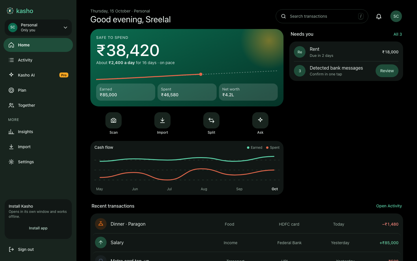
Money first. On the home screen, the thing you most likely opened Kasho to see is the largest thing on the screen. For most people that is how much they can safely spend this month, so the safe-to-spend figure sits in a large green card at the top, with a short line underneath that turns it into a daily amount. The chart and the lists come after. We removed decorative elements that were competing with that number, including a few we liked.
One loud action per page. The warm marigold colour is meant for exactly one primary action on each page: the Add button on the phone, the save button in the transaction form, the main call to action in a flow. Everything else stays calm. If everything is marigold, nothing is.
Tinted surfaces over outlines. Cards sit on a slightly tinted layer, and that layer sits on another. You can feel the depth without drawing a box around everything. Where a divider is needed, it is a hairline.
Quiet until it matters. Expenses are coral, not alarm red. Positive amounts are the brand green. Amber appears only when there is a warning to show. A healthy number is not decorated, and an unhealthy one is not shouted either. We think this is the difference between an app that is calm to live with and one that makes you feel graded every morning.
We also wanted the app to feel made for India, not just translated. Amounts use the rupee sign and Indian digit grouping, and the web can show compact figures in lakh and crore. Labels and empty states use the words people here use for rent, bills, a shared dinner and an EMI. That work is less visible than the colours, but people notice it.
Foundations: the tokens
Under the screens there is a small set of rules. They are deliberately boring.
- Colour. Each theme has a light and a dark version of the same set of roles: background, raised and sunken surfaces, text, muted text, primary, a tonal container for selected states, and paired colours for positive, warning, danger and info. We named colours after what they do rather than what they look like. A "primary container" is the soft fill behind a selected pill, not "light green 200".
- Spacing. A four-point scale: 4, 8, 16, 20, 28 and 40. Most layouts are built from 16 and 20. Horizontal gutters grow with the window: 17 on a phone, 28 on a tablet and 32 on a wide window.
- Corners. Five steps: 12, 15, 19, 24 and fully round. Cards on the phone are 24. Tabs, chips and most buttons are pills.
- Type. A small scale from 11 for captions up to 30 for display numbers. The safe-to-spend figure is the only thing on the home screen that uses the largest step, so there is no second headline competing with it.
- Motion. Short. Screen changes run for about 180 to 260 milliseconds, with a slightly springy settle on the phone.
None of these numbers are sacred. They are the agreed set. Changing one now changes it everywhere at once, which is the point.
Four themes, two temperatures
On the web, Kasho has four colour themes. On the phone, there are two accents and a light, system or dark switch. The names came from a long afternoon of arguing.
On the web:
- Green is the default. A light background with a turquoise-green accent. It is the calmest of the four and the one most of us use in daylight.
- Night is the dark version of Green. The background is close to black, the surfaces step up a few shades from it, and the green lifts slightly so it still reads on a dark card.
- Terracotta is a warm, light theme. The accent moves to terracotta and the page takes on a faint paper warmth. It feels more like a notebook than a dashboard, and some people like it more for that.
- Dusk is the dark version of Terracotta. It keeps the warm accent, but the background is a deep blue-grey rather than black, so it feels like the end of the day rather than the middle of the night.
The names matter more than they look. "Light" and "dark" describe the background. "Green" and "Terracotta" describe the temperature, and the temperature carries the mood. Some people want the cool, precise version of their money and others want the warm one. We did not want to force a choice, so both temperatures exist in both modes.
On the phone the choice is simpler: an accent of Green or Orange, and Light, System or Dark. Settings shows the accents as two swatch cards with a plain switch beneath them.
Family workspaces use the terracotta accent by default on the phone. The idea is that when you switch into a shared space, you can tell at a glance that you are no longer in your personal money, without reading anything. The accent can be set per family, and it follows the workspace across the app.
Phone: five tabs and one floating button
On a phone the app lives at the bottom. There are five tabs: Home, Activity, Kasho AI, Plan and Together. The Add button floats above the bar on Home and Activity, where recording something is most likely. It is not on every screen. A button that appears everywhere stops meaning anything.
The bar is tinted rather than white, and the active tab sits in a soft green pill rather than under a bold underline. Labels are short, and each tab is one destination rather than a menu of them.
Home
The home screen opens with the date and a greeting, then the Personal or Family switcher and the notification bell. Then comes the safe-to-spend card. It is the biggest thing on the screen and we took care over its weight. It shows the figure, a sentence saying what that means per day for the rest of the month, and a line chart that shows where you are against where you would expect to be. Under it sit three small tiles for earned, spent and net worth.
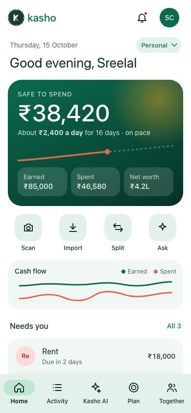
Below that is a row of quick actions: Scan, Import, Split and Ask. Each is a round tile with one word. Four is about as many as sit comfortably in one row without crowding the rest of the screen.
After that come a cash flow chart and a "Needs you" list. That list is the part we are happiest with. It collects only the things that need a decision, such as rent due in two days or bank messages waiting for confirmation. The items that need a tap get a single button. Everything else can wait.
Activity
Activity is the record of everything that has happened. The month summary sits at the top with daily bars, so you can see the shape of the month before you read a single number. A Filter button sits where a row of tabs and a type selector used to be. Filtering was the thing people reached for most, and the old controls were the most cluttered part of the screen, so we put filtering in one place.
Each transaction is a row with the merchant or note, a category icon, the account and the amount. Expenses are coral and income is green, and the sign is always visible, so the colour is never the only signal.
Add transaction
This is the screen we spent the most time on. Recording a transaction is the most frequent thing people do, so it has to be fast and forgiving.
The screen is amount first. The keypad sits at the bottom and only appears while the amount field is active, which leaves the rest of the form room to breathe. The kind of transaction (expense, income or transfer) is a pill selector. Categories are a horizontal row of chips. Extra details are offered as small chips above the keypad, so you can add them without leaving the flow. Validation errors clear as you fix each field, rather than all at once when you press save.
The save button is marigold. It is the one loud thing on the page, which is the point.
There is also a Paste SMS action for bank messages. It reads the text, pulls out what it can and fills the form. We wanted this to feel like a helper and not something that acts on your behalf. You still see the result, and you still press save.
Plan
Plan is where budgets, goals, bills and loans live. On the phone it opens as a hub: a budget-used ring, category bars, a spending-pace line and a set of tiles that link to each feature with a live summary. The hub is for a glance. Tapping a tile slides you into the feature, and going back returns you to the hub, not to whatever you last looked at.
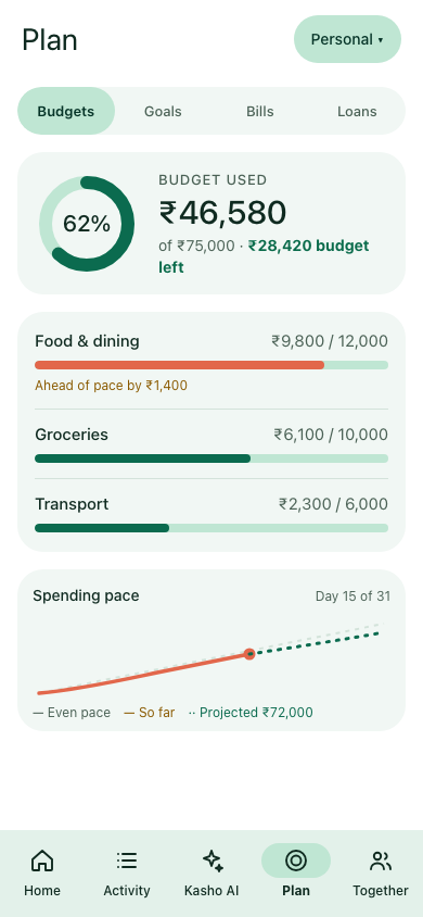
The ring is for the hub, where the job is a quick read of how much is left. Inside a category, the job is comparison, so the detail is shown as bars.
Kasho AI
Kasho AI is a hub, not a blank chat window. It opens with an ask box, then a short list of things Kasho has noticed about your money, then a toolbox of shortcuts: recap, unusual spending, forecast, what-if, receipt review. Insights and Journal live here too, rather than in tabs of their own.
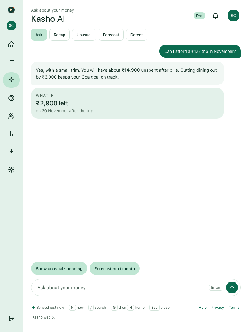
We made this choice because an empty chat box is intimidating in a money app. People do not know what to ask. A list of concrete things Kasho has already found, each with a shortcut, shows what the feature can do before anyone types a word.
Together
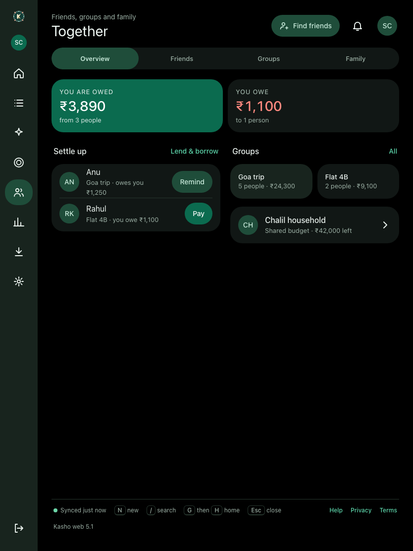
Together is for shared money: the people you split with, what you owe, what is owed to you, and your groups. The top of the screen has two cards, one for what you owe and one for what is owed, each with a settle-up action. Groups sit below as a grid of tiles, and a family card comes at the bottom.
Tablet: a list beside its detail
A tablet is not a big phone. There is room to show two things at once, so the layout changes to suit that.
From a width of about 700 density-independent pixels, the phone app puts the hubs into two columns. Plan, Together and Kasho AI each use the extra width for a second column of content rather than stretching one column across the screen. Insights shows its charts first, because on a tablet a chart has room to be a chart.
On the web, the tablet layout replaces the full sidebar with an icon rail about 76 pixels wide. Each icon sits in a 56 by 52 pixel target, the workspace badge sits at the top, and the bottom bar gives way to the rail. The labels hide, so the rail stays narrow and the content keeps its room.
For list-and-detail screens, the tablet shows a master list on the left, about 360 pixels wide, and the selected item on the right. On a phone the same screen simply opens a full-page detail. The aim was that a tablet should not feel like a stretched phone. A list is a list, and its detail sits beside it.
Laptop and desktop: the full sidebar
On a laptop, the web app shows a full sidebar about 260 pixels wide. It is tinted and has the Kasho brand at the top, then the workspace card, then the main destinations: Home, Activity, Kasho AI (with a Pro badge where it applies), Plan and Together. Under a More label sit Insights, Import and Settings. An Install Kasho card sits near the bottom for people who want the web app in its own window, with Sign out below it.
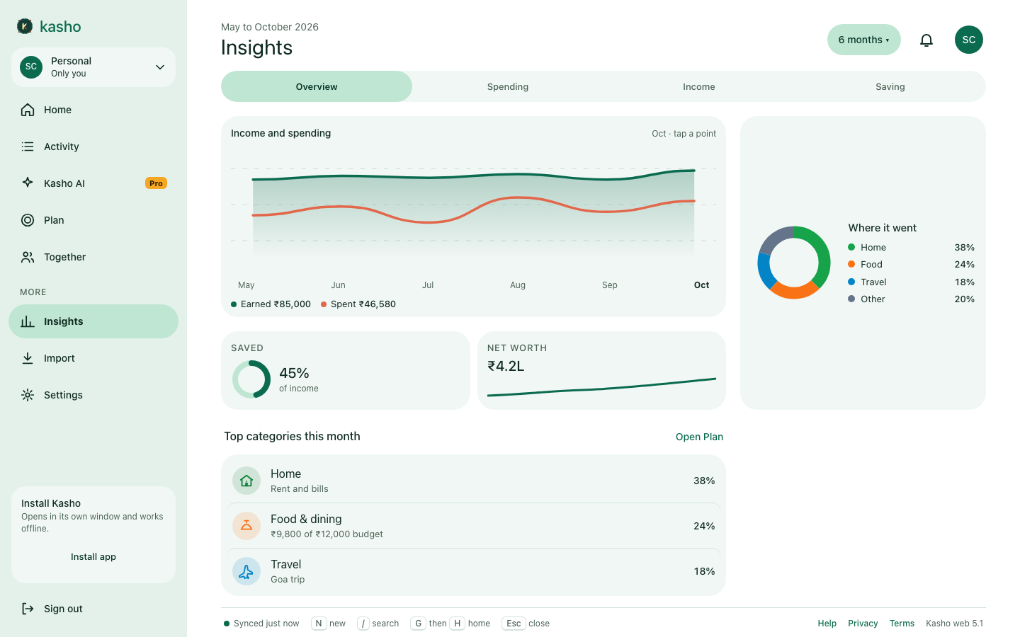
Labels are visible on the sidebar, because on a wide screen there is no reason to hide them.
The top bar is 72 pixels tall. It holds the page title and date on the left, and a search pill, the notification bell and your avatar on the right. On a phone the same bar is 64 pixels and holds only what fits. The top bar has no background tint, so it does not compete with the content beneath it.
Content has a maximum width. Once the window is wide enough, pages stop stretching and sit in a column. The native Android app uses the same breakpoints. A window 960 density-independent pixels wide or more gets a persistent sidebar about 248 pixels wide and a content column capped at about 1120 pixels. At 1280 and above, the cap is 1200 and card grids can run to three columns.
About "Android desktop": there is no separate desktop design for the Android app. A large window, a tablet in landscape or a folding phone opened up all get the wide layout, because the breakpoints depend on the width of the window and not on the kind of device. That is the rule we chose. It means that unusual window shapes may still need their own tuning, and we expect to find some of those.
Web-specific choices
A few things only make sense in a browser.
- No fixed header. Each page brings its own title and actions. The top bar keeps only what belongs everywhere, such as search, notifications and your profile. A long page scrolls naturally instead of sliding under a heavy bar.
- A skip link is the first thing a keyboard user reaches, so Tab goes to the content first.
- Reduced transparency is respected. Where the design uses a translucent layer, the page drops it for anyone who has asked their system for less of it.
- The installable app. The Install card opens Kasho in its own window, and it works offline. We did not want the installed version to feel like a second-class copy, so its layout is the same as the one in a tab.
Dark themes, honestly
Dark themes are where most redesigns quietly fail. Colours that look rich on white turn muddy on black, and shadows that were invisible in light mode become grey smudges.
Dark surfaces here are a set of stepped greys with a hint of the theme's hue, not pure black cards on a black page. Text is slightly off-white so it does not glow. The brand green lifts a little in dark mode so it still reads as the same colour, and the coral for spending gets lighter so it does not sink into the background. Input fields in the dark themes have their own visible backgrounds and borders, because a field that disappears into its card is a field people miss.
We also kept the same layout in dark mode. Some apps rearrange their screens when the lights go down, and that always made us uneasy. Dark mode here is the same app with the light turned off.
What we took out
Design is as much about what you remove as what you keep.
- The currency row in Settings. Settings is now about how the app looks and behaves, and the row was out of place there.
- Sign-out and the legal links on the phone. They moved to the You area, after the privacy, terms and security rows, where people look for them.
- Duplicate controls on Activity. The old tabs and type selector did the same job as the filter, so the filter stayed.
- Repeated chrome on the web. The sidebar does not repeat the title of the page, and each page header is not repeated in the bar above it.
The first minute
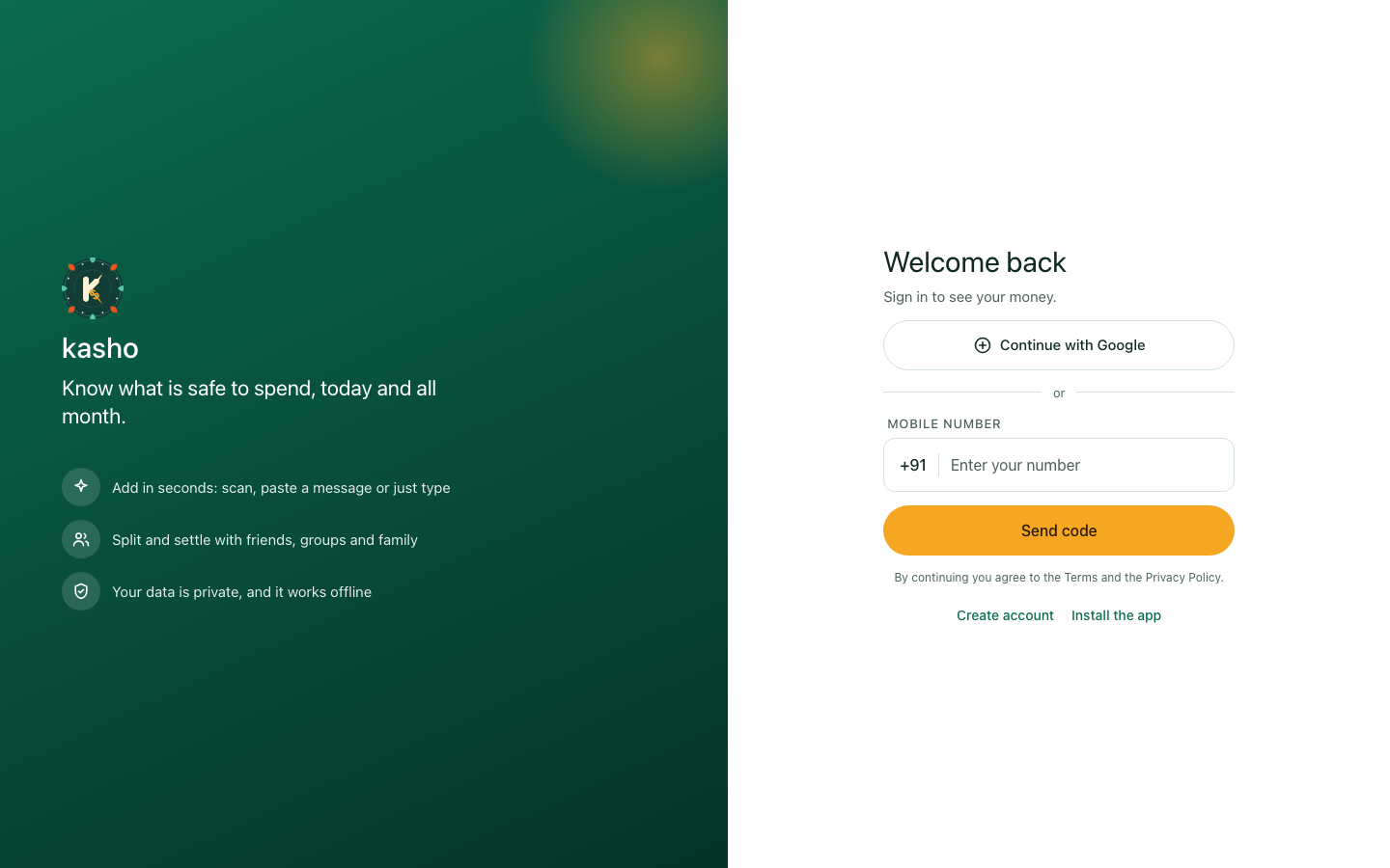
The first minute is the part most people never see again, so we took care over it too. Sign-in opens with a set of feature slides on a tinted stage with a faint rangoli pattern behind them. The splash screen uses the same colours, so there is no jolt when the app opens. Onboarding is a four-step setup, and the steps reflect what you have already done, so a step you have finished does not come back at you.
The app-lock prompt comes after your first transaction rather than before it. People were not ready to think about a PIN before they had seen anything useful. We may move it again.
What is still rough
We are not calling this finished.
- Not every screen has been through the new pass yet. The core of the app and the hubs have. Some of the more specialised corners have not, and we are working through them.
- Parity between web and phone is by hand. The phone reads from a shared token package, and the web keeps matching values in its own CSS. Drift is possible, and we would like the two to share one source.
- Some in-between widths between the phone and wide layouts need more testing than we have given them so far.
- The marketing screenshots are generated from the same fictional data as the design board and must be refreshed whenever something visible changes. It is a chore, and we would rather say so than pretend otherwise.
If you use Kasho and something feels off, we want to hear about it. A shade of grey, a button that jumps or a number in the wrong place are exactly what we are looking for.
Why it matters
Money apps can feel like a chore to open. The aim of this redesign was not to make them exciting. It was to make the people, the numbers and the next thing you need to do clear enough that opening Kasho feels like checking on something you already understand. If it does that on a phone on the bus, a tablet at the kitchen table and a laptop late at night, the work was worth it.